Homad, a creative coworking and event space in Sion, had a logo but needed a cohesive visual language to unify their identity across both the physical and digital realms. The goal? To bring clarity and personality to their branding, tying together the space itself with their online presence.
To bridge the gap, we crafted a modular visual language that works everywhere—from signage and printed materials to social media and the website. We wanted the new visuals to break away from the space’s original muted beige tones, adding energy and contrast that could seamlessly flow from physical to digital.
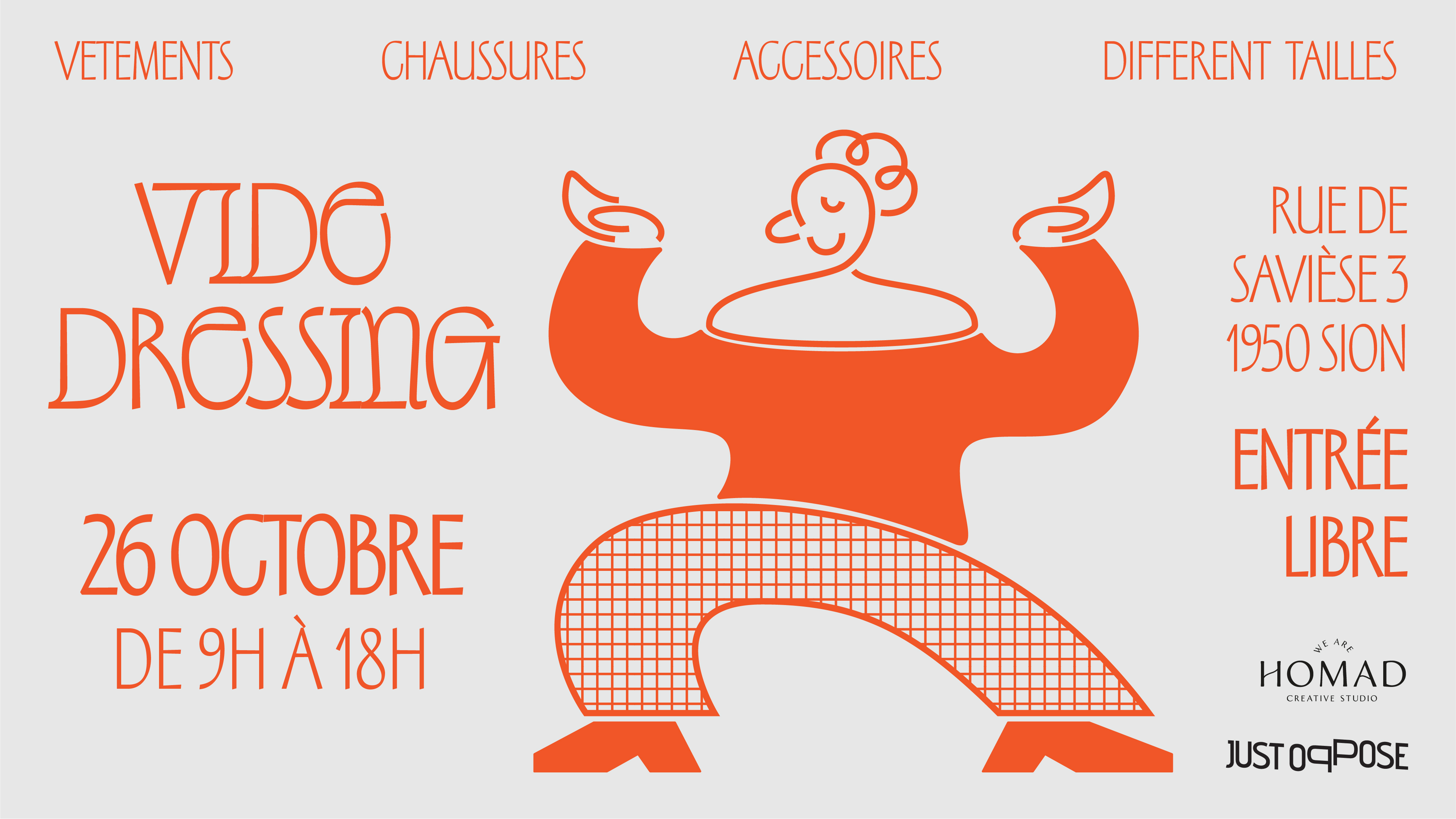
The standout feature of Homad’s space? The beautifully designed arches framing its windows. Inspired by these shapes, we used the arch as a central design element—creating a modular system that could evolve and recombine to form a variety of layouts. This shape became our foundation, adding a unique, playful element that reflects the flexibility and creativity of Homad itself.
With this new visual language, Homad now has a flexible, memorable identity that brings cohesion to their space and communications. The arches are ready to take center stage, online and offline, setting Homad apart with a design that’s as dynamic as the community it hosts.